The Negapunks

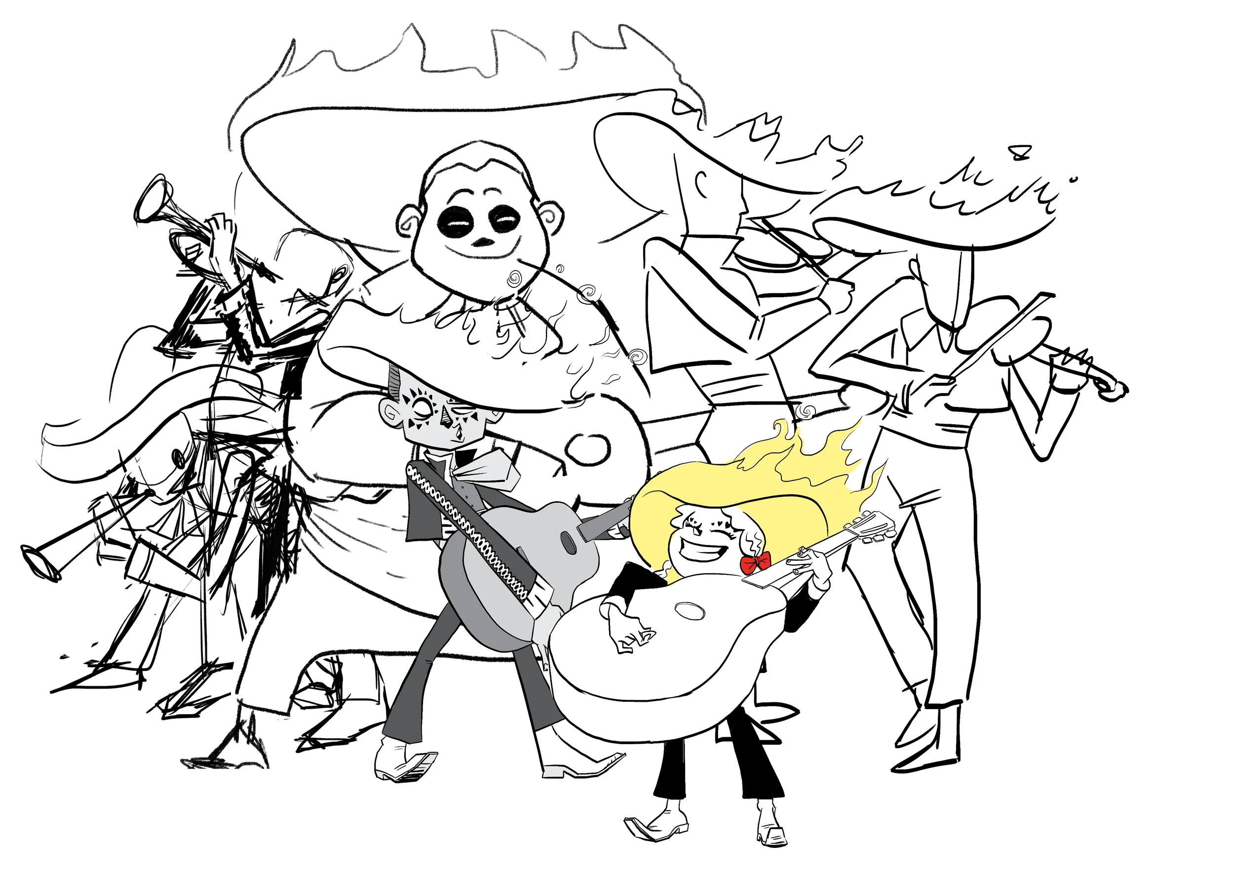
Another entry into a series of illustrations for which I have yet to come up with a name. The first piece in the series was The Curse of the Mariachi. And now I give you...

The Negapunks

The Negapunks were your normal, every-day pop punk band until the dopey leader of their street team developed the photos he took at one of their shows in off-brand photo developing chemicals. The pics were no good but the Negapunks found themselves transformed into a trio of reversed out punkers. 

PROCESS POST: Curse of the Mariachi

With Pizzanaut I'm trying to focus my work and explore my own personal style in a way I never really have. One thing I rarely do is a fully composed piece and this Mariachi illustration was my first go at that.

The characters have been bouncing around in my head for a few years now. It was probably three or four years ago when I first started doing these sketches:

I did around six or seven of these. I had an idea for a comic where they were a normal mariachi band who showed up to play a show but forgot their sombreros. Luckily they found a set of long forgotten sombreros hidden away in the basement of the venue. Little did they know these sombreros were cursed! When they put them on, the sombreros caught fire and they were each possessed by spirits.

I continued to do sketches and drawings of the characters here and there. But never moved forward on the comic idea.

When it came time to work on a piece for my portfolio I figured they'd make a great subject for an illustration.

I began by rethinking their design. This was my first go at it. But I just wasn't feeling it. For some reason coming at the characters with this static pose wasn't working for me.

So, instead of being methodical (which honestly, I should have done) I tried to get there organically by focusing on more gestural poses.

This approach yielded much better results. I decided I wanted to simplify the coats and facial markings quite a bit and brought a lot more detail and design to the instruments themselves.

Once I was happy with the design of the characters, I shifted focus to composition. However, as I usually do, I really only focused on the composition of the characters, and not really on the background. This is invariably my downfall. Character is what really excites me, creatively, so I end up giving short shrift to the setting (you'll see how this comes back to bite me). So my focus was just on the character placement in the beginning.

With each character drawn and initial colors done, I started playing around with how they were composed. My first drafts of the drawing had each of them with yellow flames and it felt a bit overpowering.

So I tried varying the color of the flames and instruments and I really liked the result.

You can also see that I was starting to think about how it would function as a promotional piece here. (I felt it prudent to abandon the "blah blah blah" slogan in later drafts)

I settled on the composition you see below and then did some rough lighting tests. I'm sure a lot of the lighting in this isn't really accurate. I tend to do what feels right, rather than what is literally correct.

You can also see, above, that I've finally roughed in a background and a few foreground elements. I would eventually abandon the top-most foreground element at the advice of my wife. It was causing more distraction than I wanted.

Once I had a rough idea of the lighting and background, I focused in on shading and highlighting each character starting with the violinist at the top. This is a step I rarely focus on and I think you can really tell the difference here when you look at other things I've done.

After getting a bit further along with the colors, I felt the background was looking really empty. 

So instead of an open-backed stage I decided to go with something little more "gazebo-ish." However, I could see the papel picado (cut paper) banners wouldn't make sense, physically, in that space. And on top of that they weren't very dynamic anyway. So I redrew them to pull the eye into the illustration. With that done, a few tweaks to the illustration, and the tone and values of the color I arrived at the final piece.

I'm really pleased with the end result on this one. It's the first full illustration I've done since improving my skills in various ways, and I think it shows. I plan on doing a few more illustrations in this vein. Supernatural music groups. So you can expect more in the future.

Also, you can guy this as a print if you so desire. Just click here.

Curse of the Mariachi!

At long last, this piece is finished. I'll be using this on postcards to send out to art directors in hopes of getting some illustration work. I'll post a write-up on the process behind this one soon. In the meantime it's for sale as a print! Go here to buy it.


Pizzanaut is GO!

Activate interlocks!
Dynatherms connected!
Infracells up!
Megathrusters are go!